Simply 13 hilariously bad design fails that will have you facepalming into next week
Someone came up with these designs, someone approved them, and someone made them. In a few cases, some poor soul even bought them. And you’ll be wondering, with each of these 13 hilariously bad design fails, how it ever got that far.
They are our favourites from 40 chosen by the good people of Bored Panda from the ‘crappy design’ subReddit.
1. ‘It’s only bloody penis pasta’

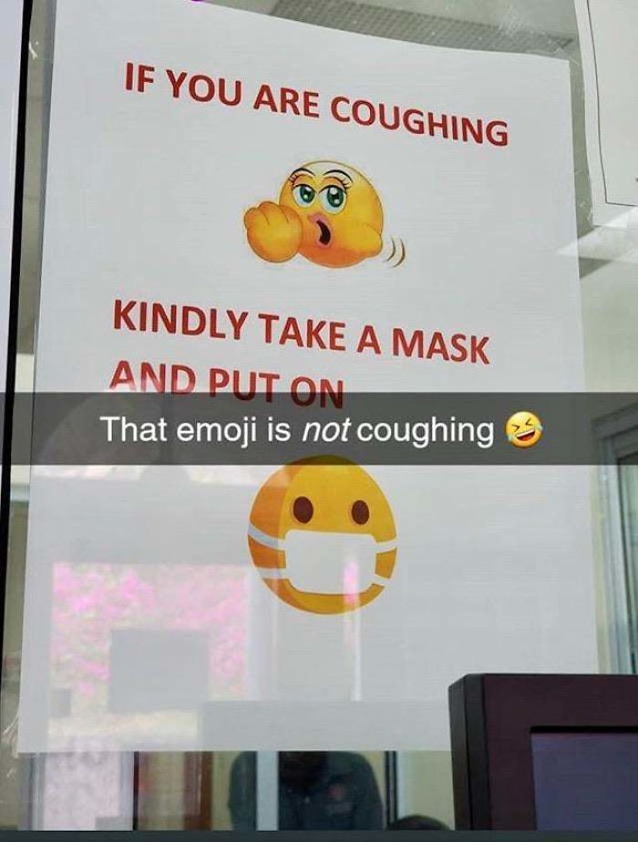
2. ‘School health clinic may need some emoji education’
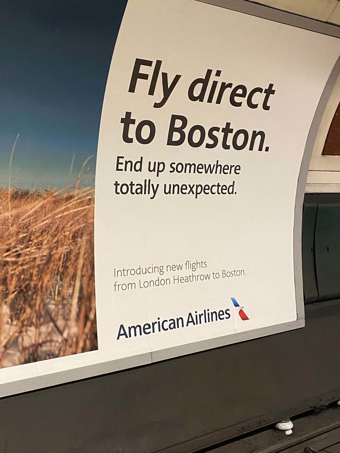
3. “Exactly how unexpected can it hope to be?’
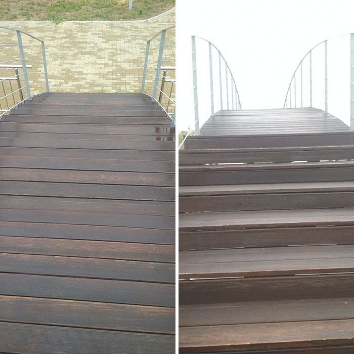
4. ‘That’s how I broke my leg’
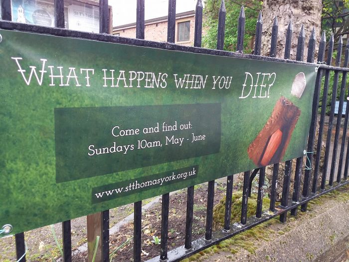
5. ‘You’re okay, thanks’
6. ‘Actually won a competition’
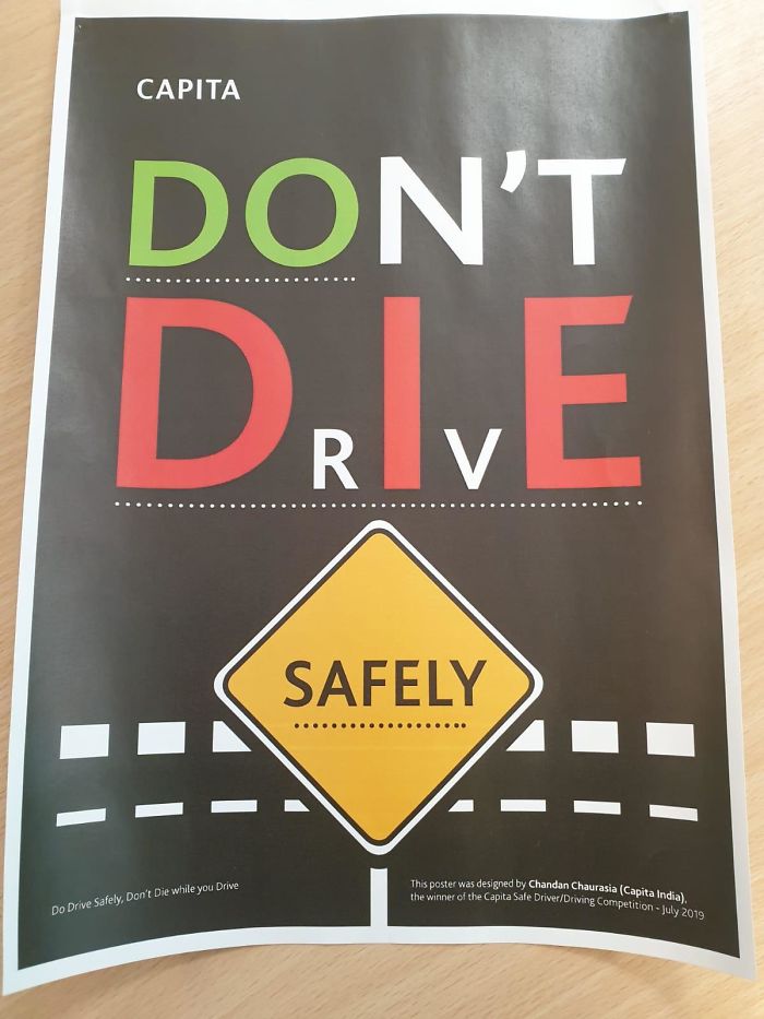
7. ‘At the local gym’
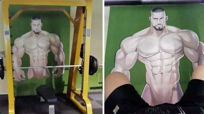
8. ‘Been trying to figure out what this sign means for the past 5 years’
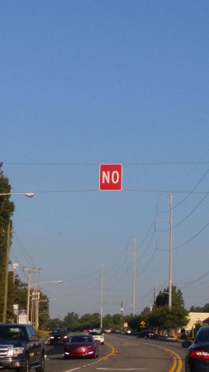
9. ‘Comes wrapped in plastic, obviously’
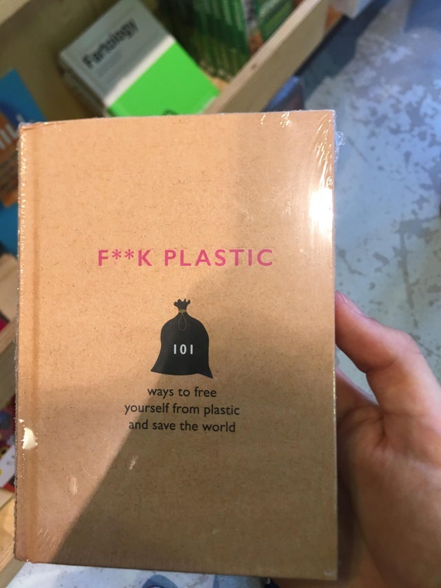
10. ‘What, ALL of them?’
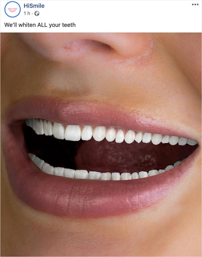
11. ‘Easier to take the stairs’

12. ‘Those shorts!’
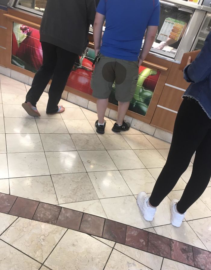
13. ‘View from outside the front door’
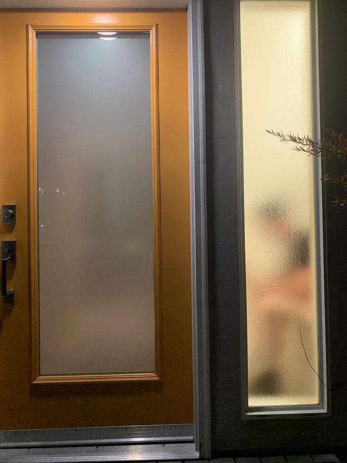
READ MORE
18 really awkward children’s playground design fails
Source Bored Panda
