Simply 40 epic design fails that are hilarious and occasionally infuriating
Not everything is designed as well as it could be. There are often little tweaks that could be made to make something work even better than it already does.
These things, though, these things don’t require minor adjustment. For these epic design fails, there is only one place for them – the bin.
Here are 40 of them, a whole bunch of glorious design fails as featured on the subReddit, r/crappydesign.
1.
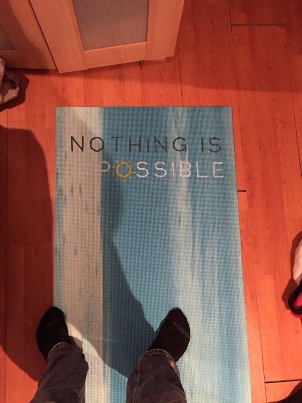
‘Yoga mat is unintentionally pessimistic’
2.
‘I’m Sure You’re All Wondering Why I’ve Gathered You Here Today’
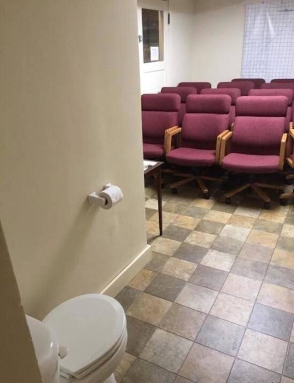
3.
‘His shirt meant to say ‘dope’ but now I only see ‘pedo’’
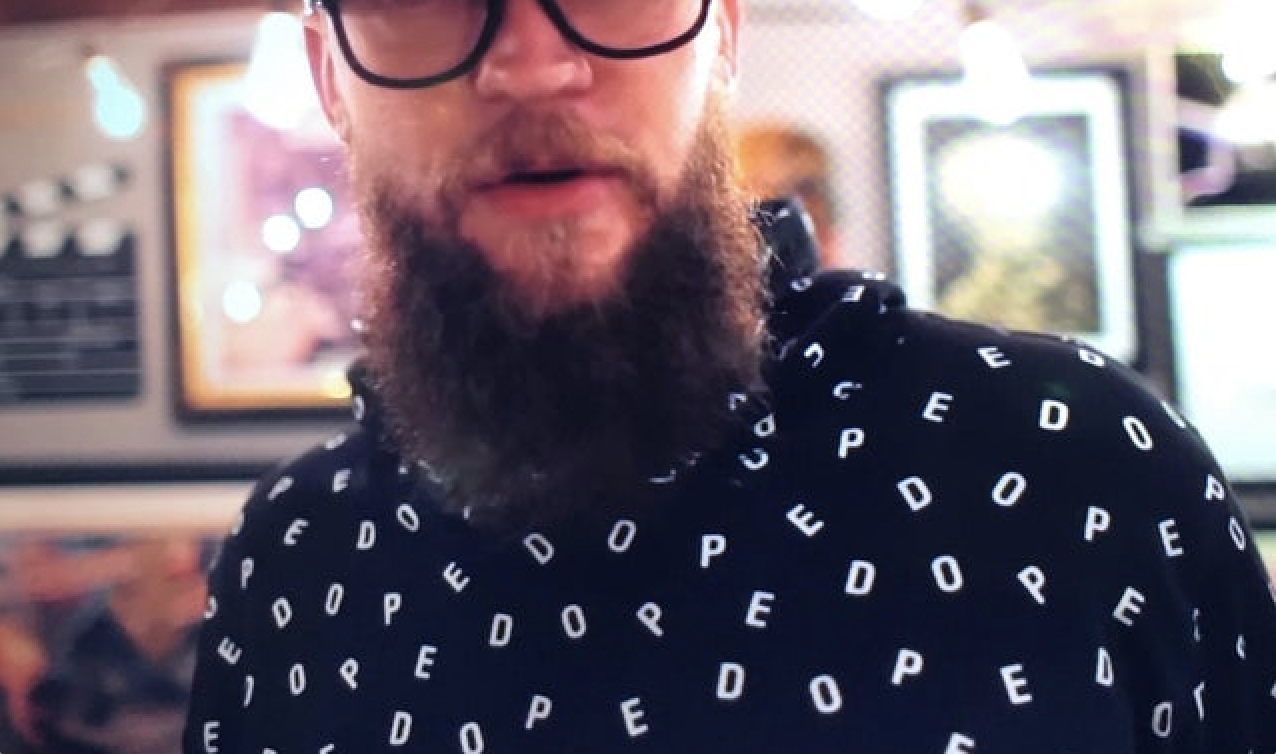
4.
‘Would you like your chips with or without chips?’
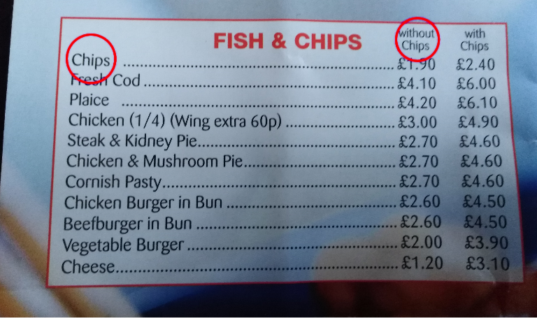
5.
‘Should PROBABLY put a little more emphasis on the apostrophe’
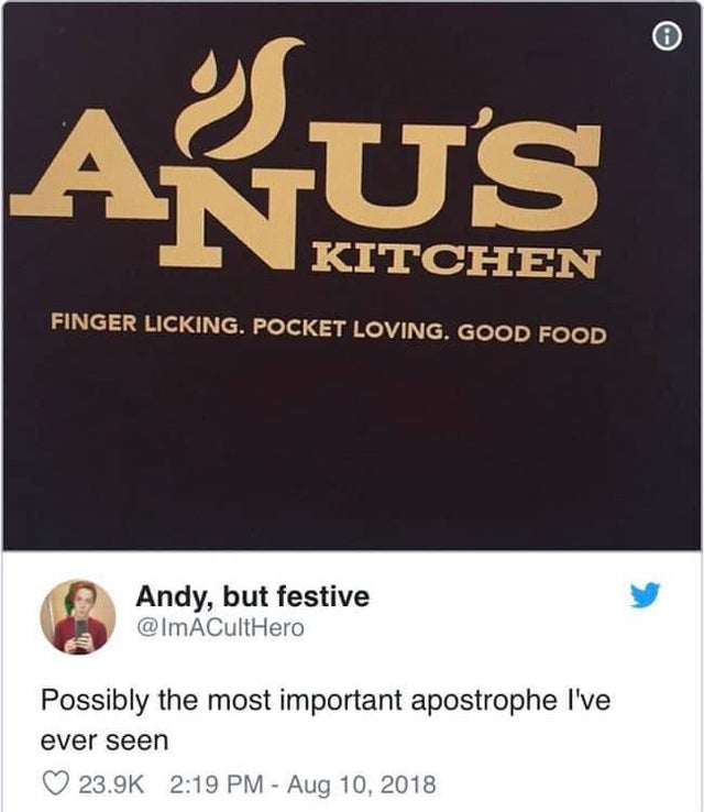
6.
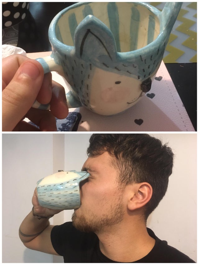
‘Nothing like the smell of coffee and a good eye-stab in the morning’
7.
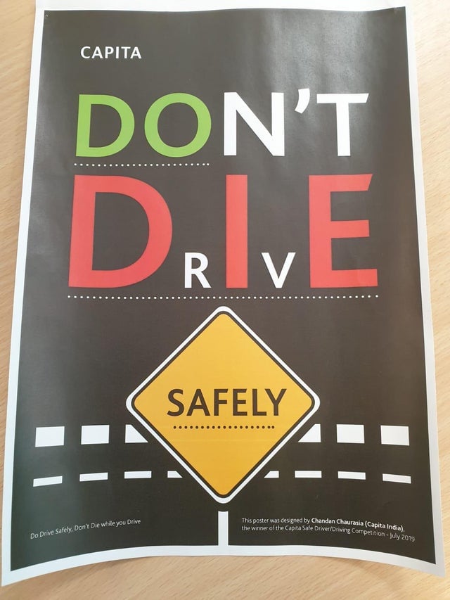
‘This won the design competition’
8.
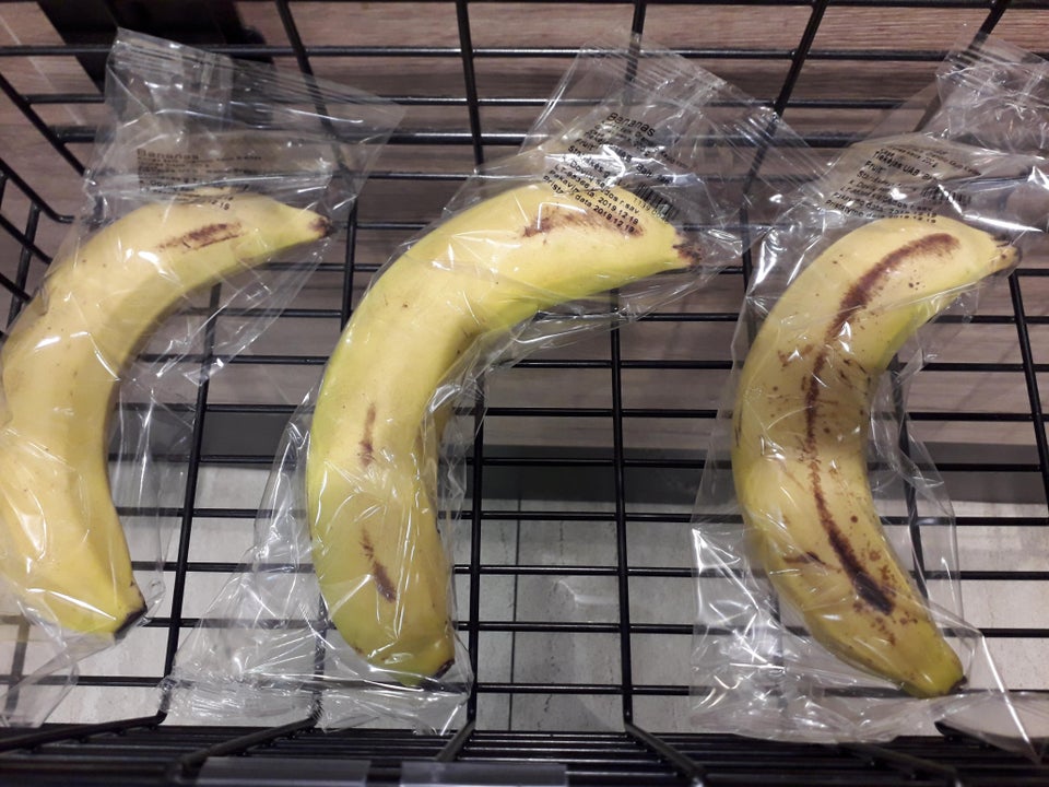
‘Ladies and gentlemen, the pinnacle of human stupidity’
9.
‘I followed this bus for 4 blocks to wait for it to pull over to share this beautiful work of art’

10.
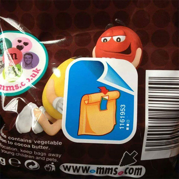
‘Thanks, I’m Not Ripping That Off’
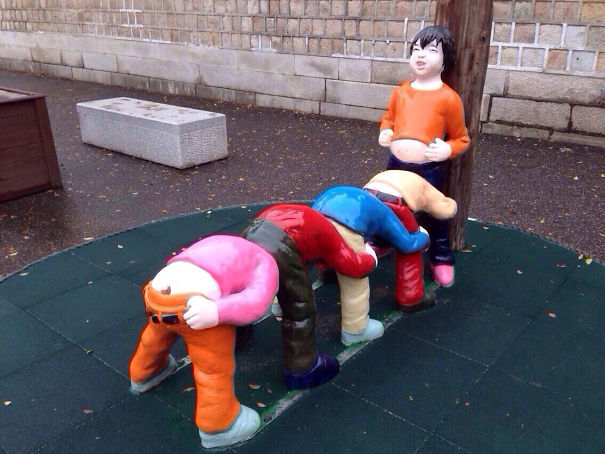
11.
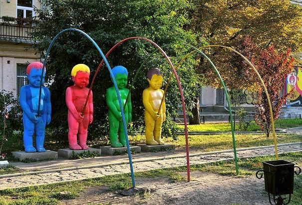
‘My Friend Is In South Korea And She Saw This In A Playground’
12
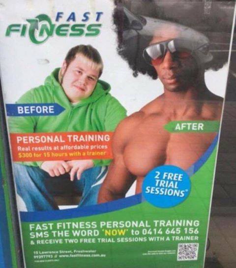
‘I Used To Be A Tubby White Guy…’
13.
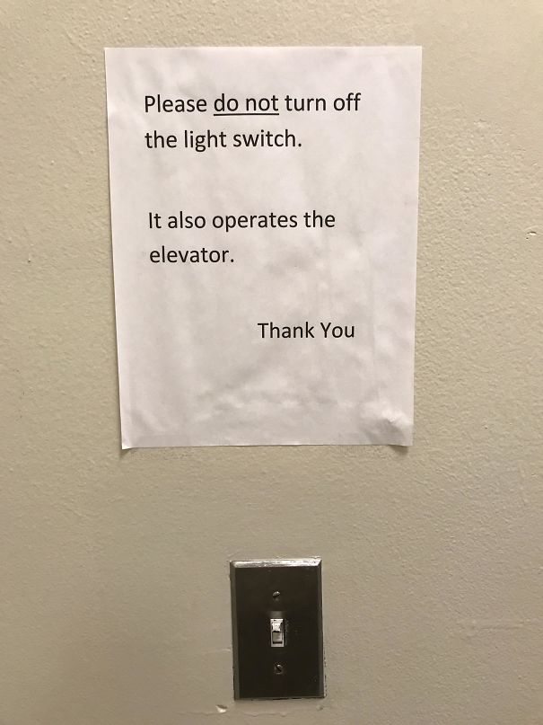
‘This Light Switch’
14.
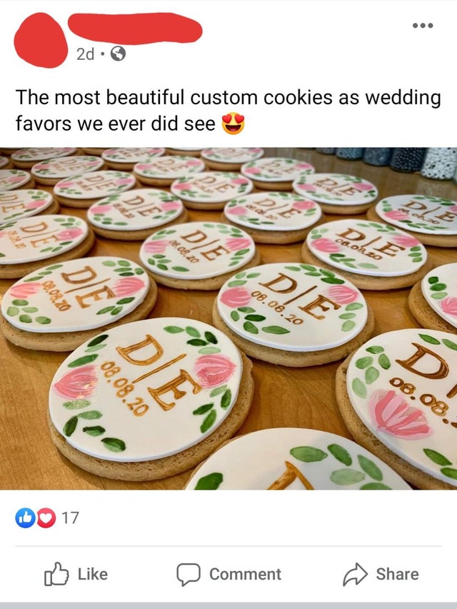
‘Tell your wedding guests to die’
15.
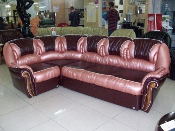
‘Not exactly subliminal’
16.
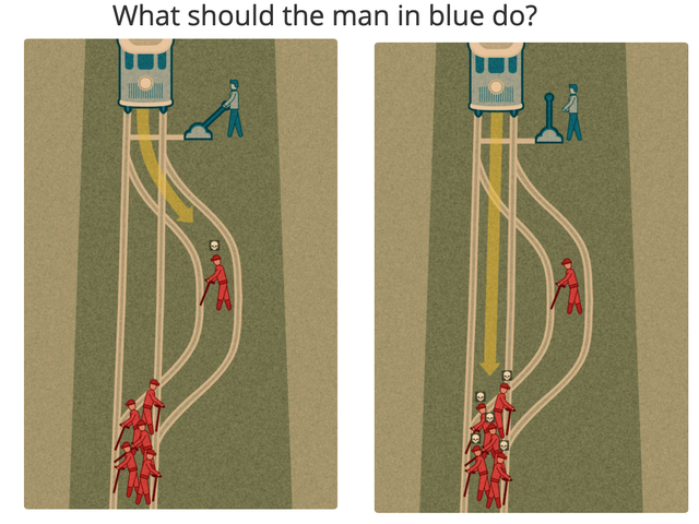
‘Would you rather kill 5 or 6 people?’
17.
‘Playground’
18.
‘That’s how I broke my leg’
19.
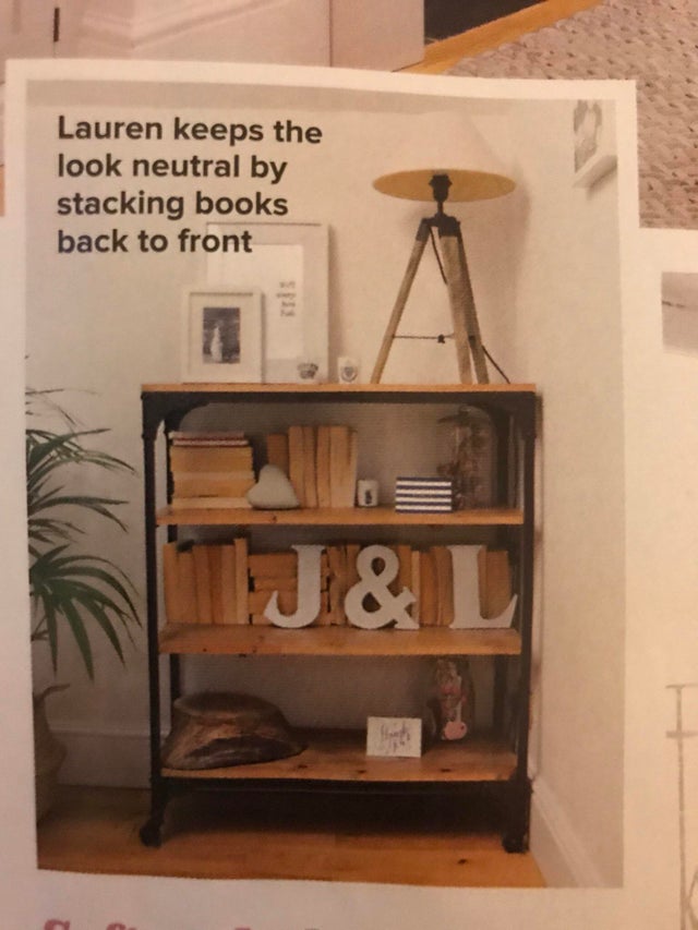
‘I’ve never met Lauren but I already know I don’t like her’
20.
The wheels on the new Mac Pro don’t have locks. They cost 550$. from r/CrappyDesign

