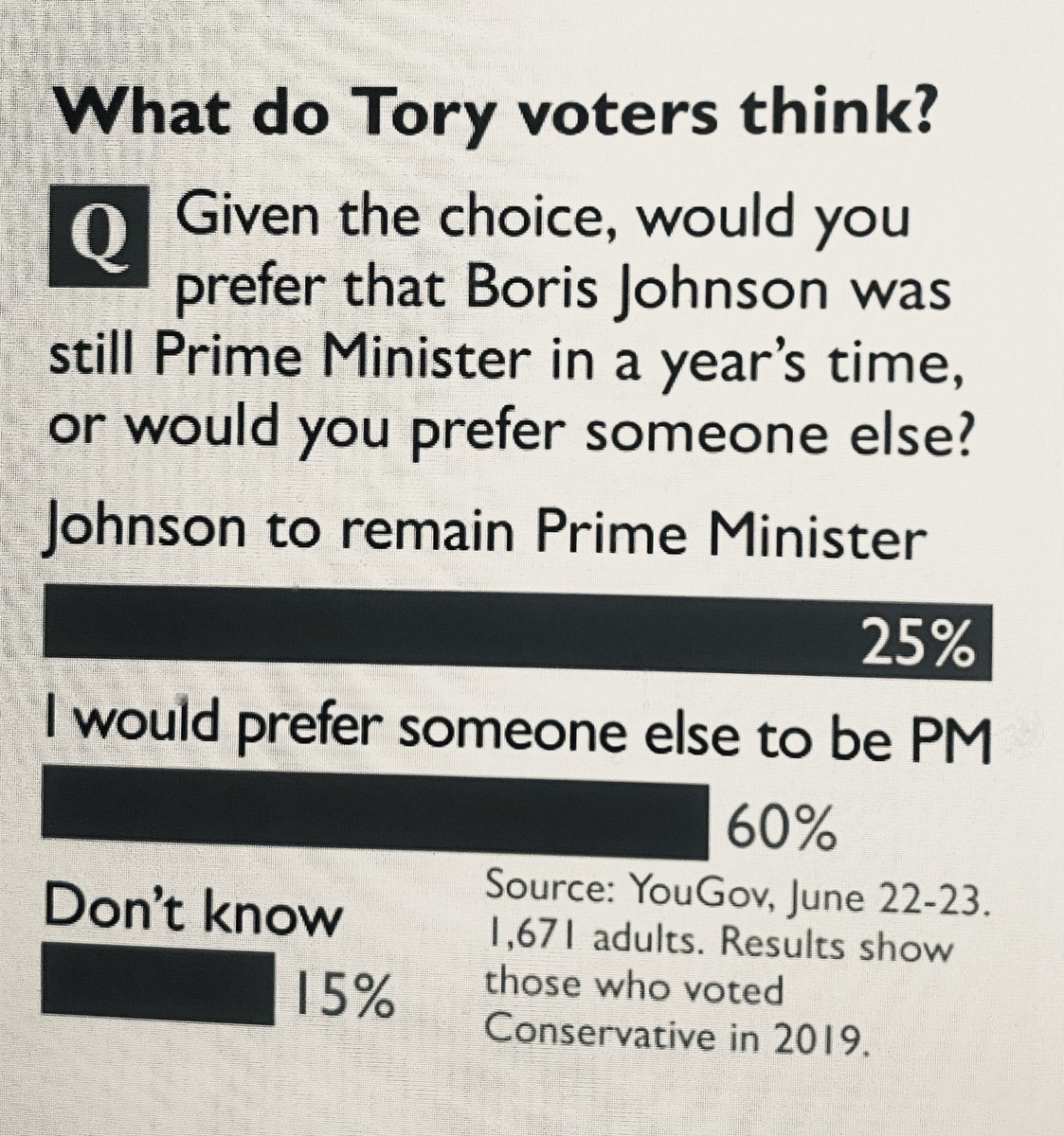
This Times graphic about Boris Johnson’s popularity had people bellowing into their breakfast
To The Times, where the paper had some interesting stats to report about Boris Johnson’s popularity among Tory voters.
And it wasn’t the figures themselves that sent it viral, it was the way Rupert Murdoch’s publication presented them.
See if you can spot why.

The graphic was sent viral by teacher @mrwbw among others on Twitter, where it was spotted by one of the paper’s journalists and is now being put right, by all accounts.
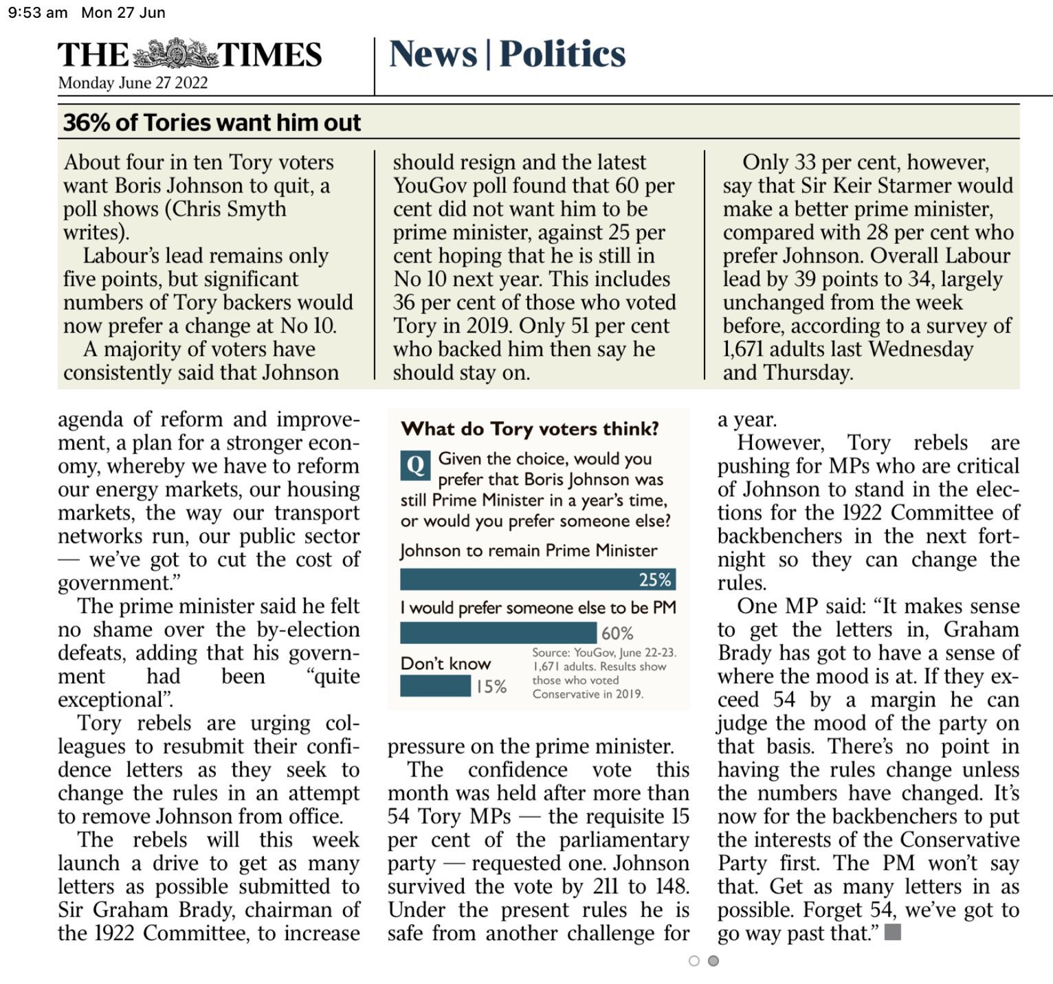
Here it is in the wider context of the piece it was trying – and failing – to illustrate.

And just some of the many things people were saying about it.
Surely this is a joke @thetimes ? https://t.co/Mx0QJN7QSs
— Chris Bryant (@RhonddaBryant) June 27, 2022
Great idea. I might use that graph style when I report exam results to Trustees in the autumn.
— Jonathan Mountstevens (@MrMountstevens) June 27, 2022
Up there with this Murdoch offering from Australia. pic.twitter.com/JvTjGqP85Q
— Ancient Spoonbill 💉💉💉 (@AncientSpoonbil) June 27, 2022
Well now. That’s a very questionable data representation by @thetimes… pic.twitter.com/qsYs5icZvQ
— Mike Galsworthy (@mikegalsworthy) June 27, 2022
Has Rachel Johnson had anything to do with this? pic.twitter.com/OjLc3mwidf
— Dougal Darcy (@MrDarcyDog) June 27, 2022
https://twitter.com/twlldun/status/1541337945449308160?s=20&t=etiP814U7xdk_GBJz-Djfg
I remember our Geography GCSE class having a lesson devoted to spotting and interpreting dubious graphs, charts, and data.
Another dodgy practice is using “rate of change of rate of change”, or as one of my teachers said, never trust anything showing a second differentiation— James Head (@jameshead) June 27, 2022
WANT MORE POKE?
Get the best of the day’s posts delivered direct to you by joining The Poke+ on Facebook
Source Twitter @mrwbw
