26 ‘They didn’t think it through’ moments from r/CrappyDesign
14. Needs a rethink on both the font and the spacing
15. They should probably have put the Arts department in a different wing
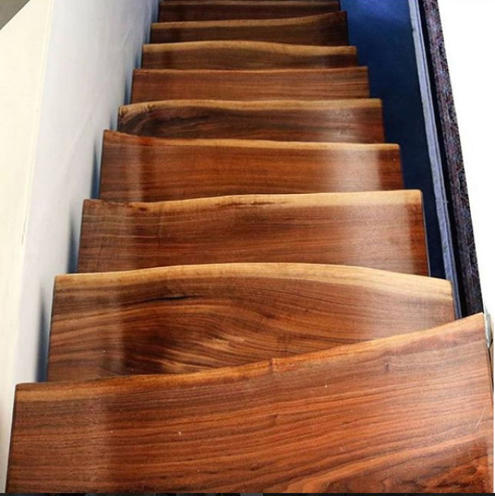
16. When you want the stairs to look great even if they’re neck-breakingly dangerous
17. When you hate kids but love recycling
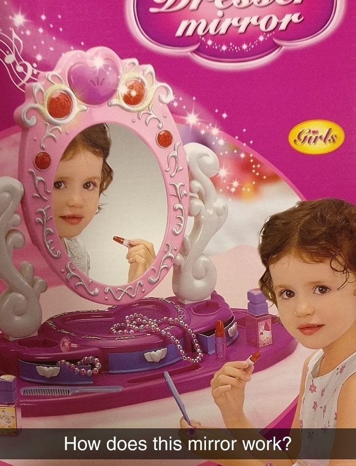
18. Bad design or a haunted toy?
19. Did they really have to go in this order?
20. What are they serving?
21. Adopt, and if you love animals Don’t stop eating them! Shop!
22. I’ll pass, thanks
23. Clear as mud
24. Analytical technology company problems
25. A bad place to make the cut
26. Who needs privacy?
BONUS
I can’t believe I found this in the wild! Found at the Crystal Palace in Las Vegas.
byu/DaftAquarian inCrappyDesign
READ MORE
Simply 40 epic design fails that are hilarious and occasionally infuriating
Source r/CrappyDesign Image Screengrab


