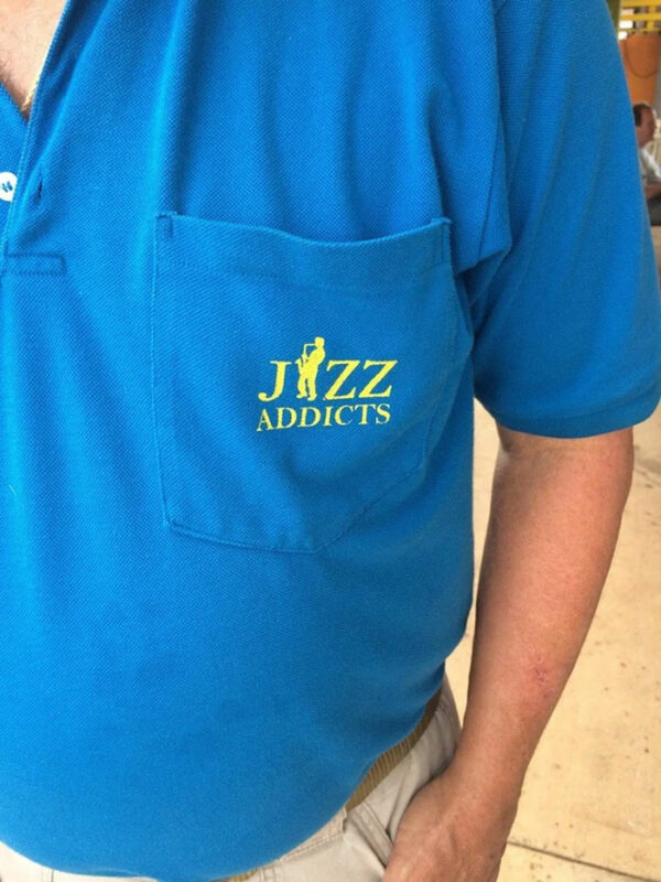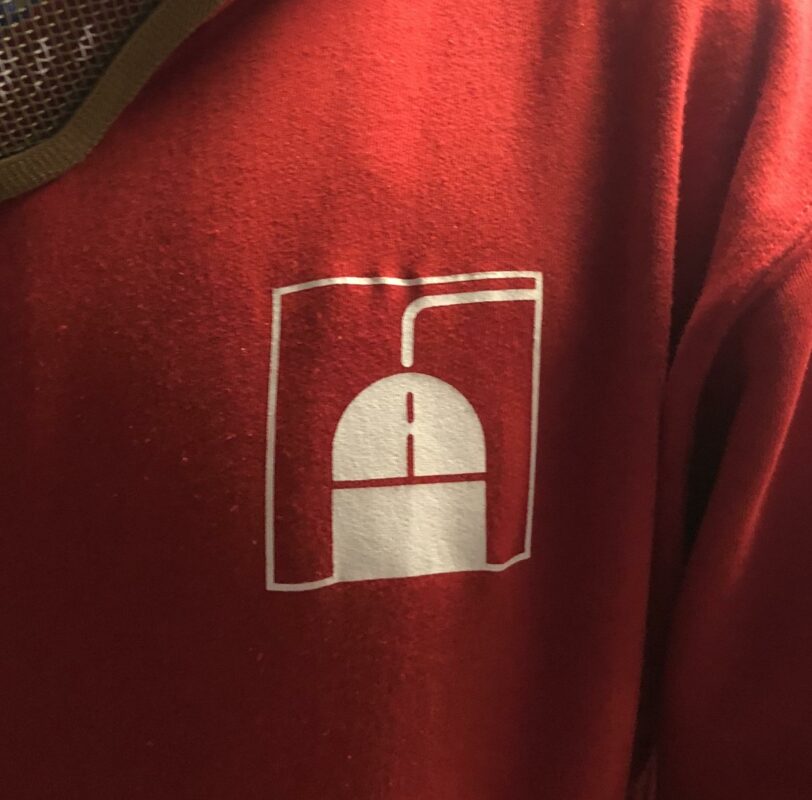
‘No, logo!’ 17 hilarious logo fails which should never have got past the first draft
There are good logos and there are bad logos, and then there are these really, really bad logos which should never have got past the first draft.
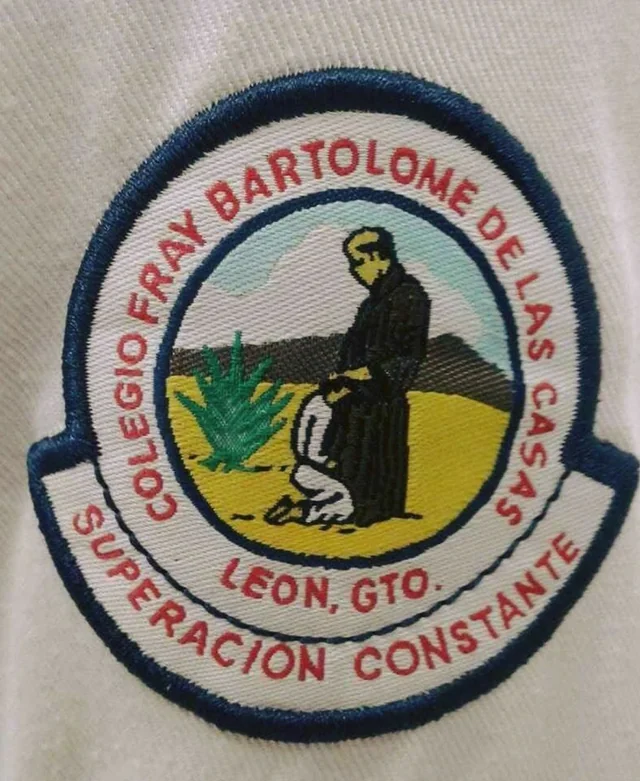
1. ‘This catholic school logo’
2. ‘Now that’s just a bad logo. Period’
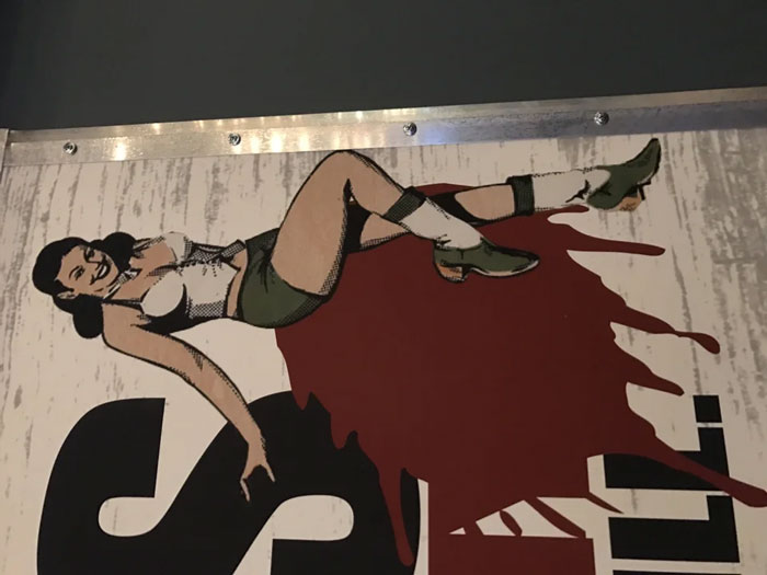
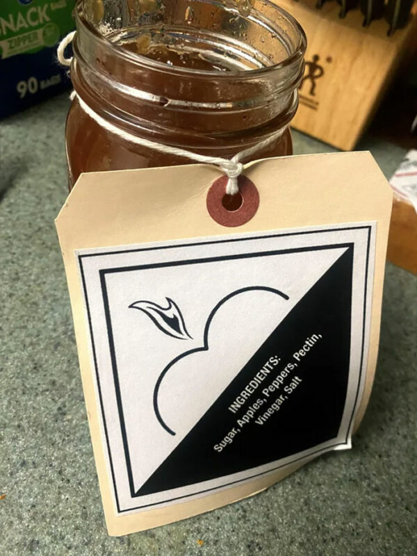
3. ‘The logo for this spicy apple jelly’
4. ‘This Medical Centre’s Logo Is A Flat Line’
5. ‘Not the greatest logo…’
6. ‘Whoever Designed This Logo Made A Terrible Mistake’
7. ‘Girls water polo team logo’

8. ‘An unfortunate logo for a fitness center’
